In Dev
Enterprise Tool
EdTech
SAAS
Timeline
6 weeks
June - Aug 2024
Team
1 UX Designer
1 PM
2 Engineers
My Role
UX Design
UX Research
Conduct UX Audit
CONTEXT
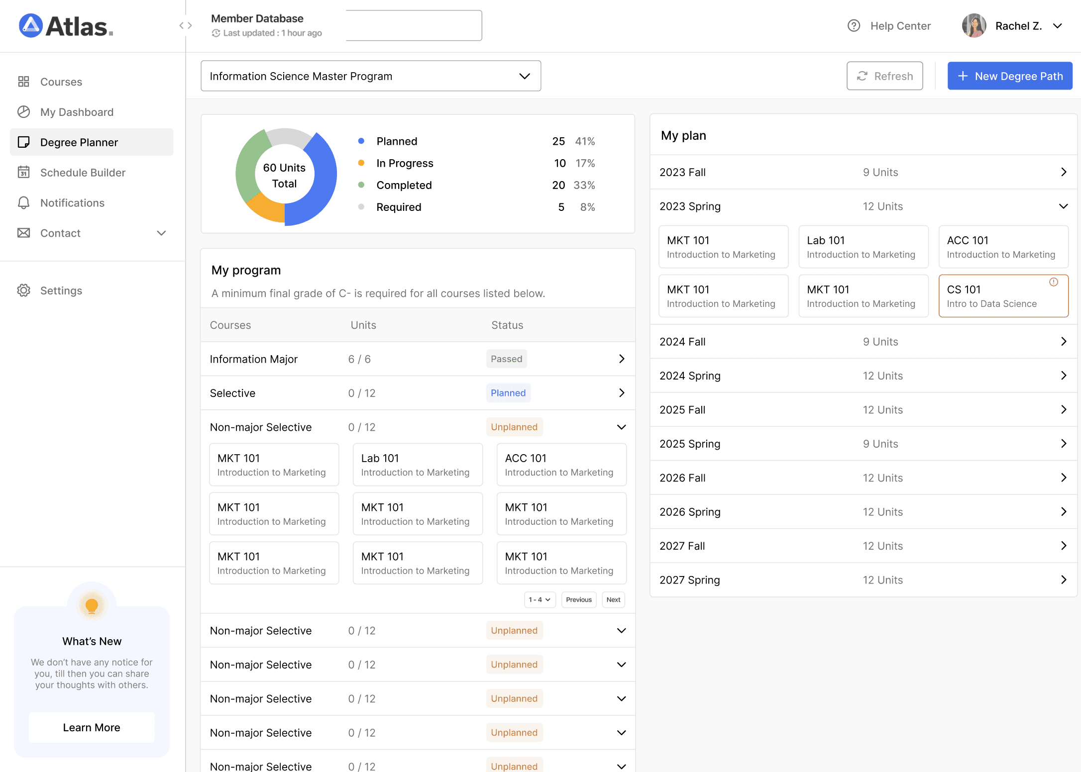
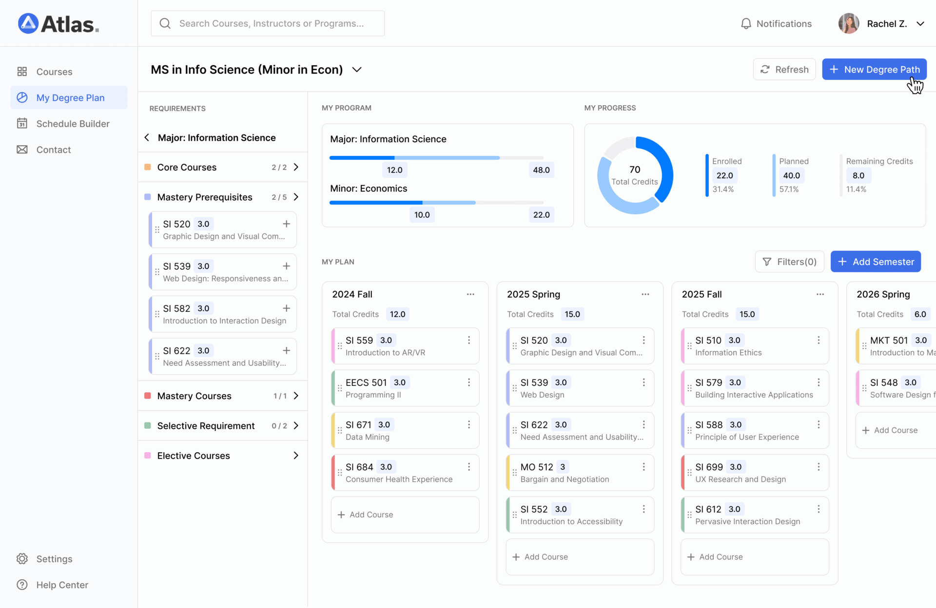
Atlas is a learning management system developed by the Center for Academic Innovation, benefit more than 50,000 students directly at the University of Michigan and potentially over 1 million users at Michigan Online.
As the product designer on this project, I led the end-to-end redesign of a core academic planning dashboard. I identified key usability pain points, and collaborated with students, advisors, and cross-functional teams to reimagine the course planning experience. The redesigned dashboard empowers students to plan their courses more easily, track progress toward their degree, and make informed, confident decisions throughout their academic journey.
FINAL DESIGN SOLUTION
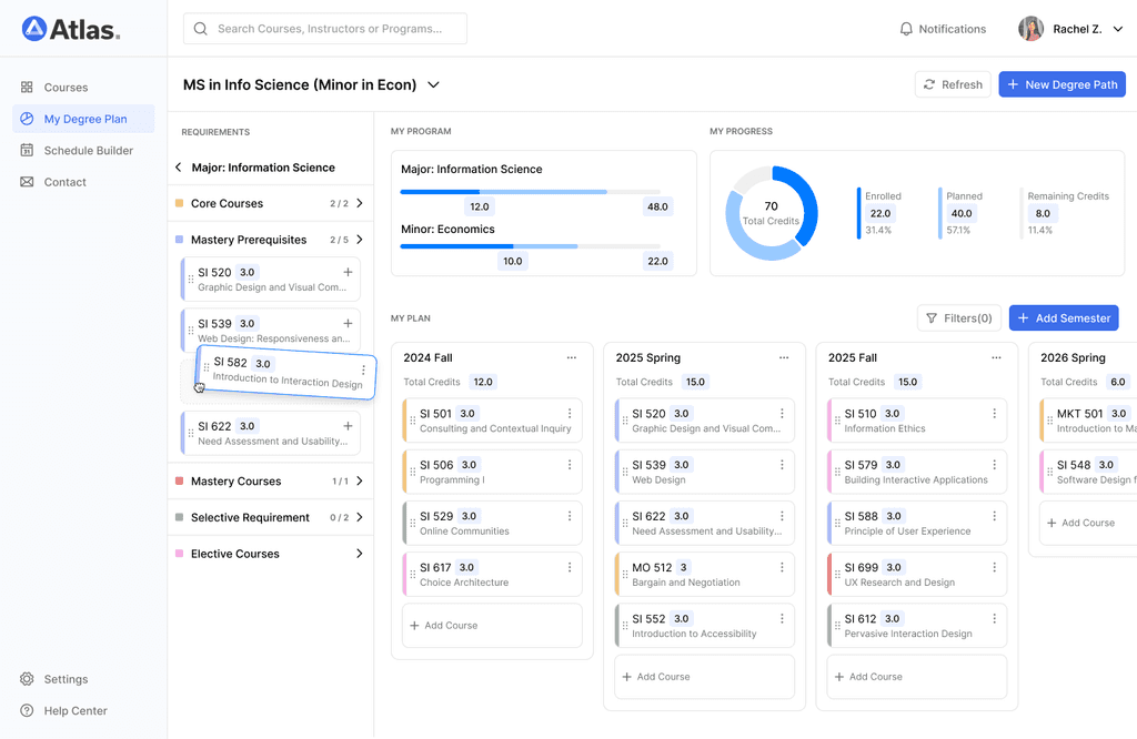
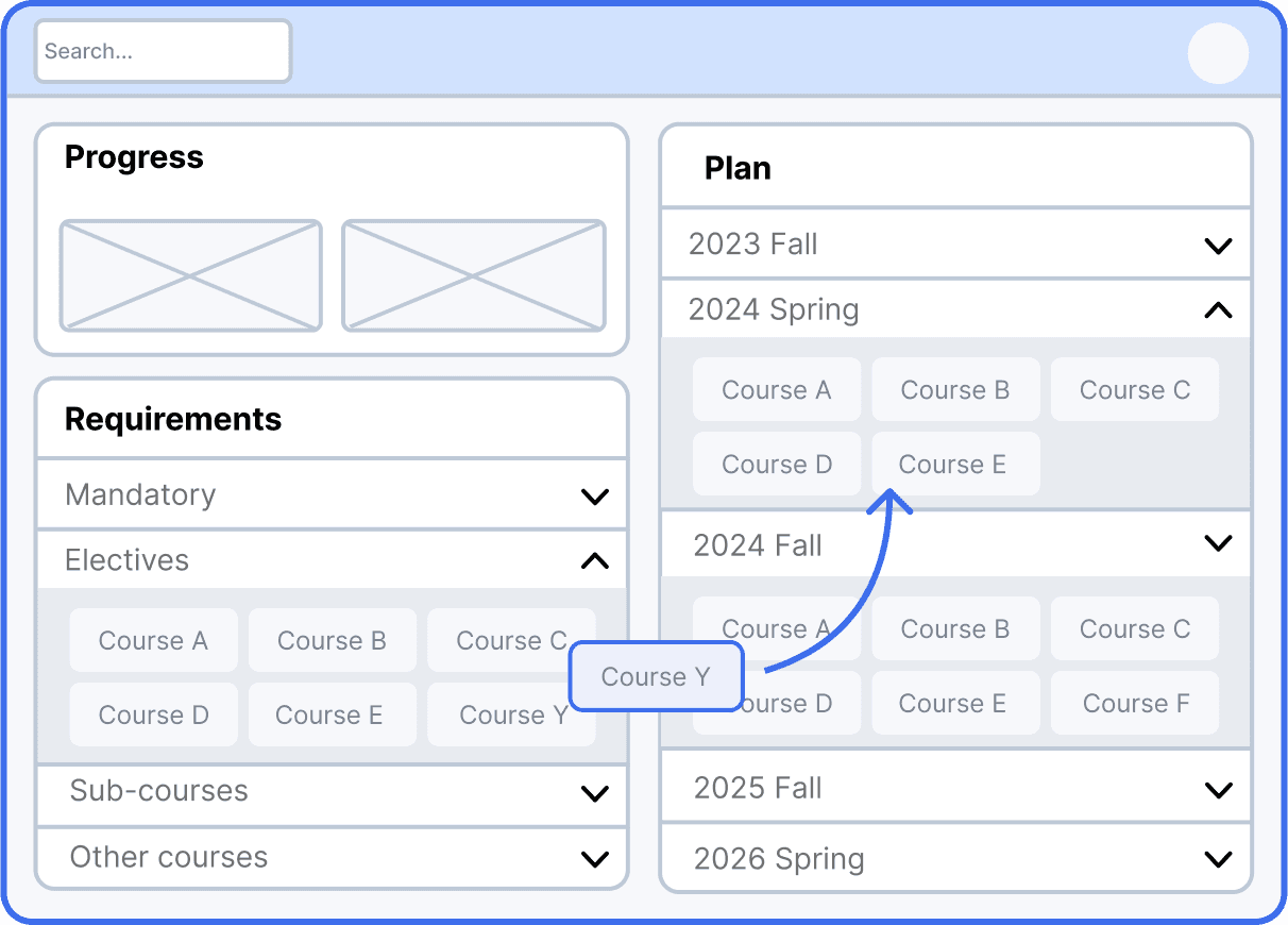
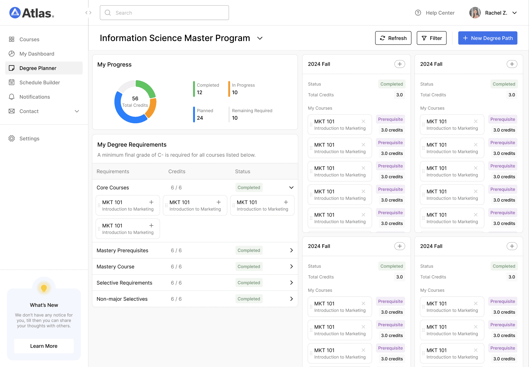
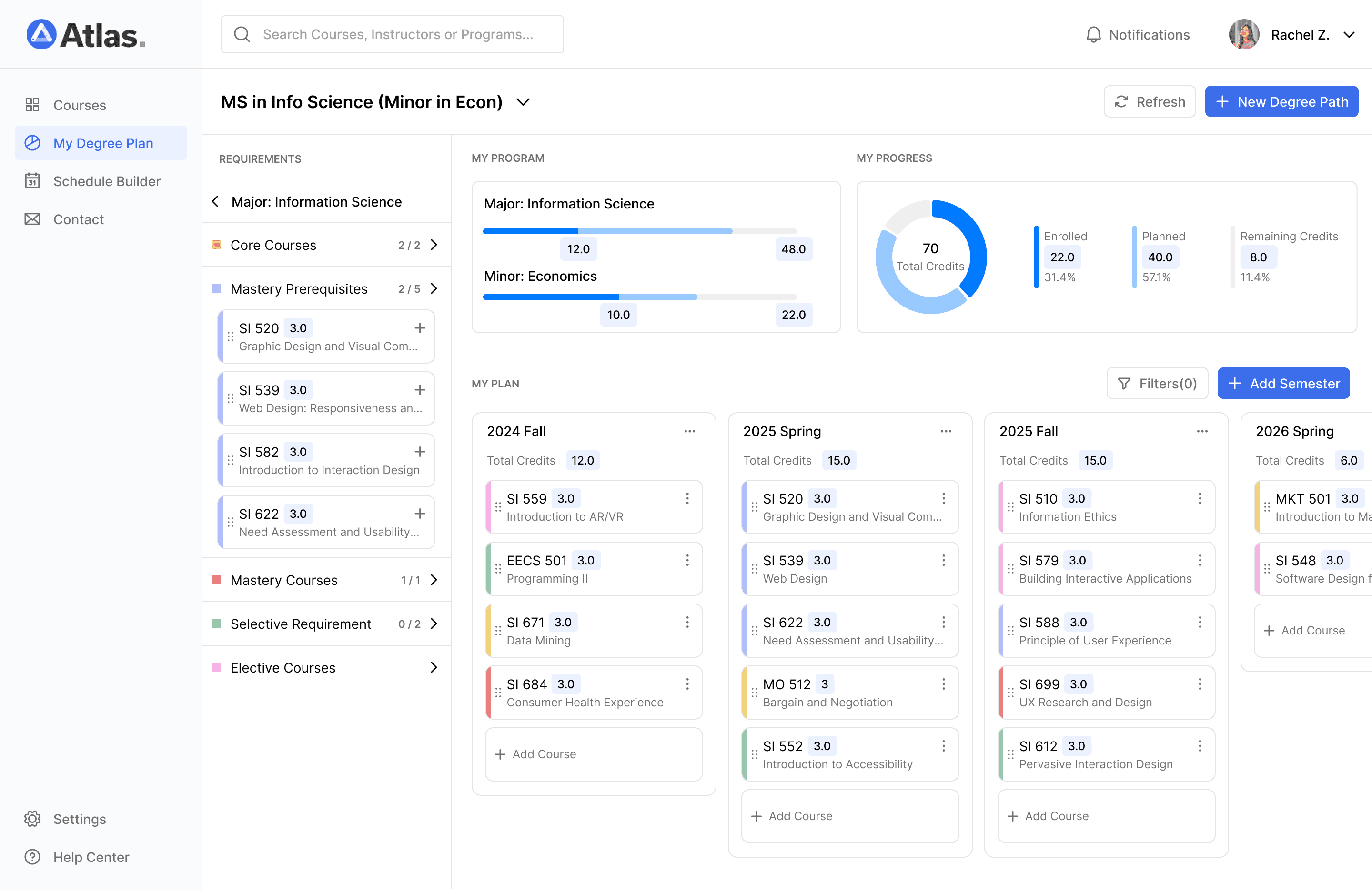
Browse degree requirement courses at a glance
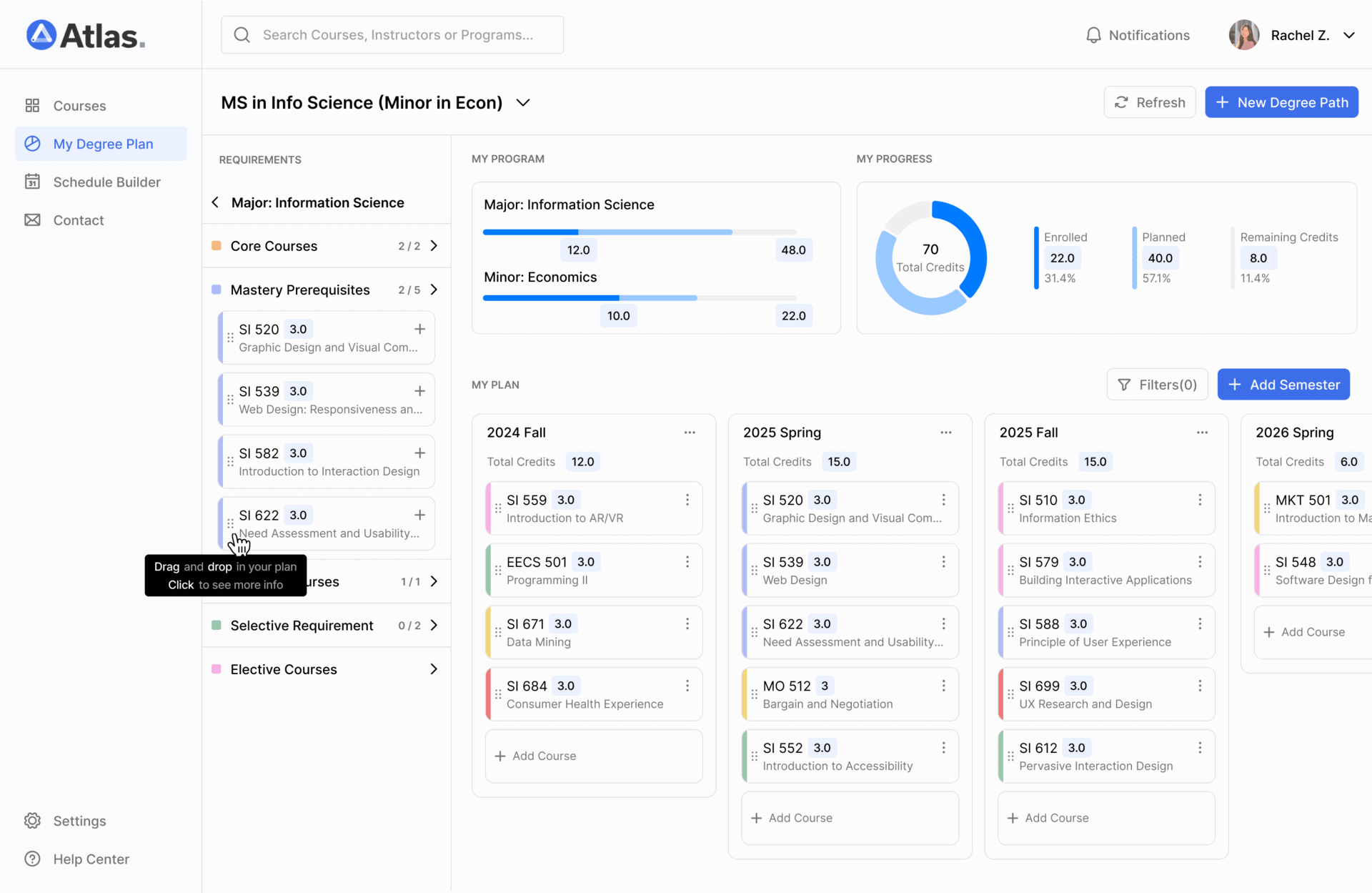
Drag and drop to effortlessly plan courses across multiple semesters
IMPACT
This dashboard simplifies course planning, saving time, reducing stress, and helping students achieve better results.
Improved Academic Success
90% of students report better understanding of degree requirements.
Streamlined Planning Process
Saves students an average of 5 hours per semester in course planning.
Enhanced Flexibility and Adaptability
Users can now update their long-term plans within minutes. Increase task success rates by 32%.
PROBLEM
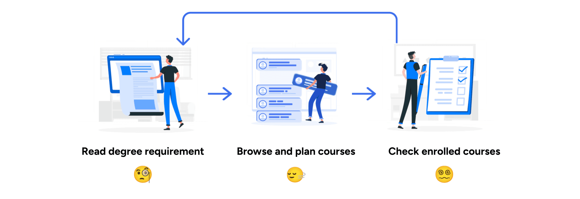
Time-consuming back-and-forth: switching between multiple documents and platforms to gather information and make decisions
Imagine you're a college student excited to start your study and meet degree requirement. You start by reading documents, trying to figure out what courses you need. You select a few courses from the catalog and add them to your plan, but wait—are they the right ones? Which ones have you already taken? And which ones do you still need to finish? You have to check out the document again.
RESEARCH
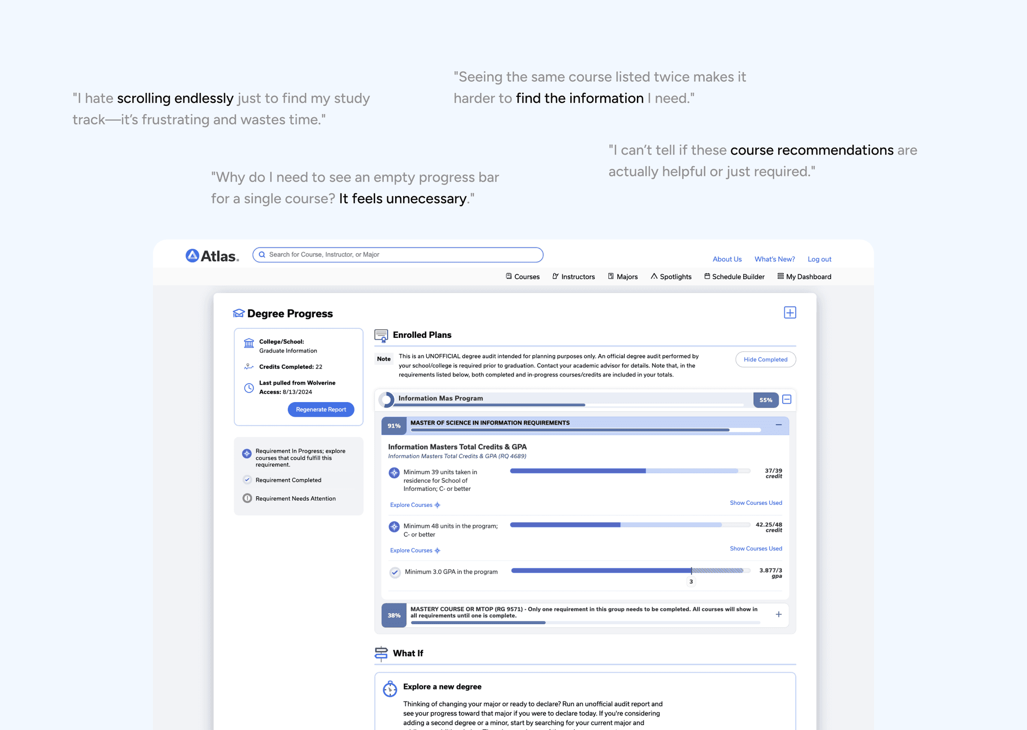
User highly value screen efficiency

User Interview
Conducted 12 in-depth user interviews to understand their needs and the expectation for degree planning products.
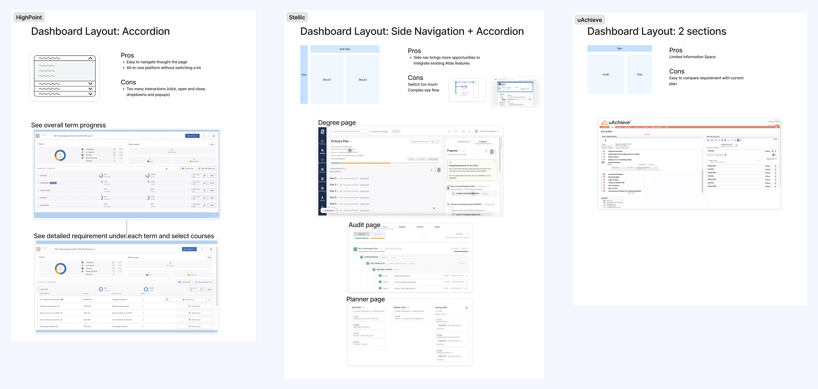
Competitive Analysis
Analyzed 4 academic tools and degree planning platforms, focusing on layout exploration.
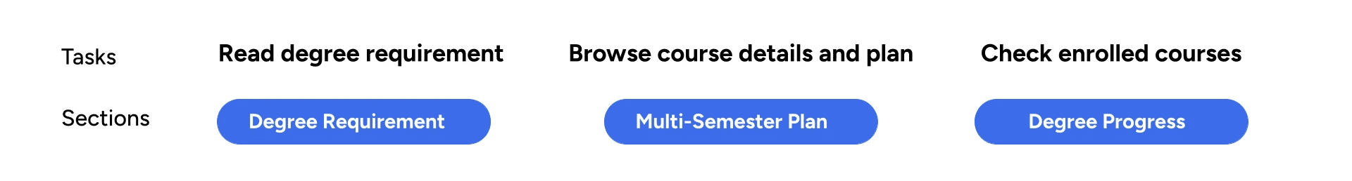
Top 3 sections and tasks users focus on:
DESIGN PROCESS
I explored design concepts to provide a glanceable layout for users switching between these 3 sections
Concept 1: Accordions
❌ Not glanceable when multiple semesters are expanded
Concept 2: Accordion + Group Card

Final Concept: Accordion + Kanban Board

✅ Enhance flexibility and scalability
Clearly communicate the system status to users
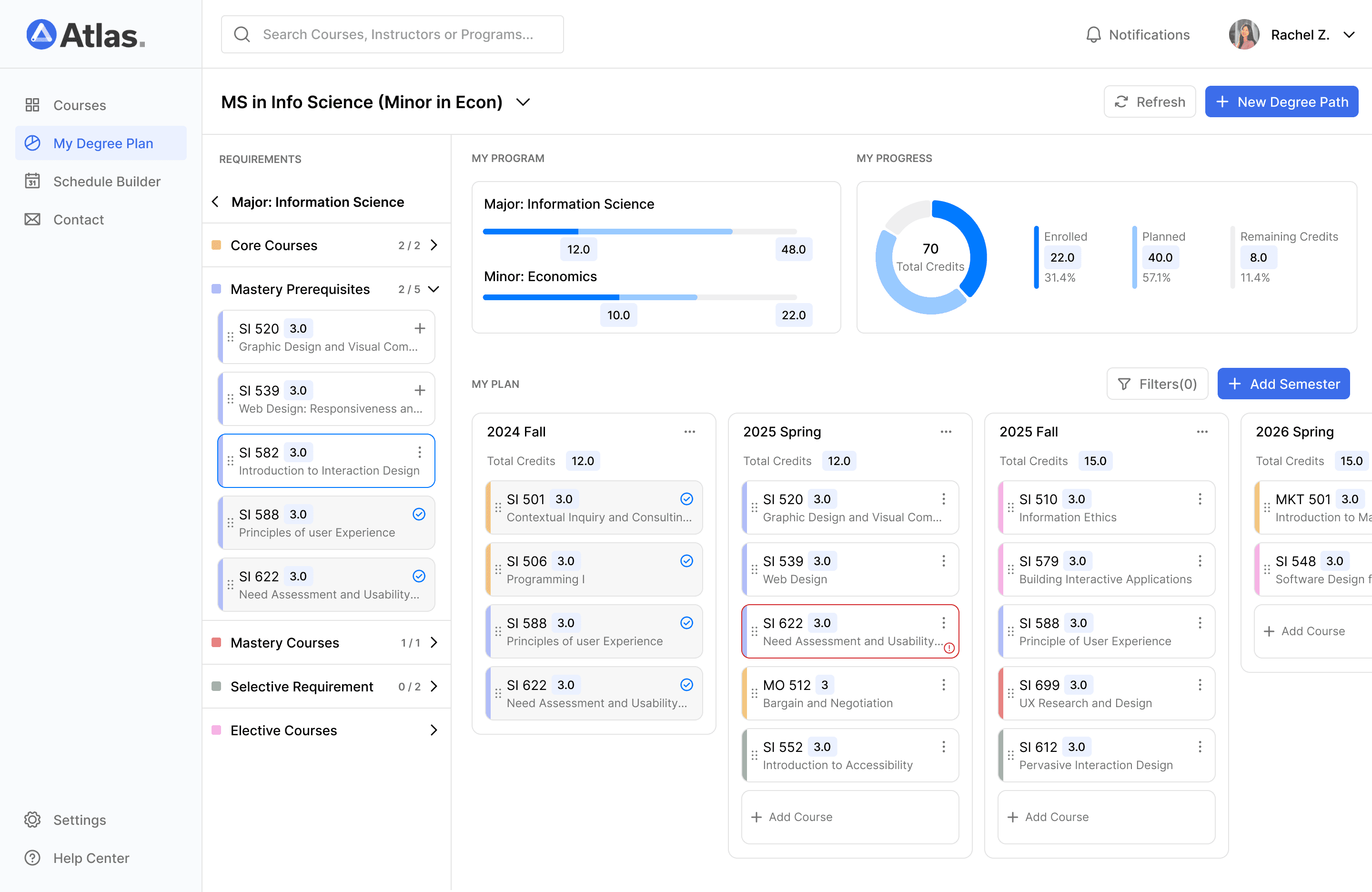

Use color coding to easily differentiate between requirement courses

See necessary information at your finger tips
Adjust course plan easily across semesters

Create a new "What-if" degree path
REFLECTION
Balancing clarity and flexibility in complex dashboard workflows
Learned the importance of balancing clarity and flexibility when designing for complex workflows.
Addressed user pain points such as confusing layouts, repetitive information, and limited exploration options.
Designed a more intuitive and glanceable dashboard that improved user experience.

DISCOVER MORE
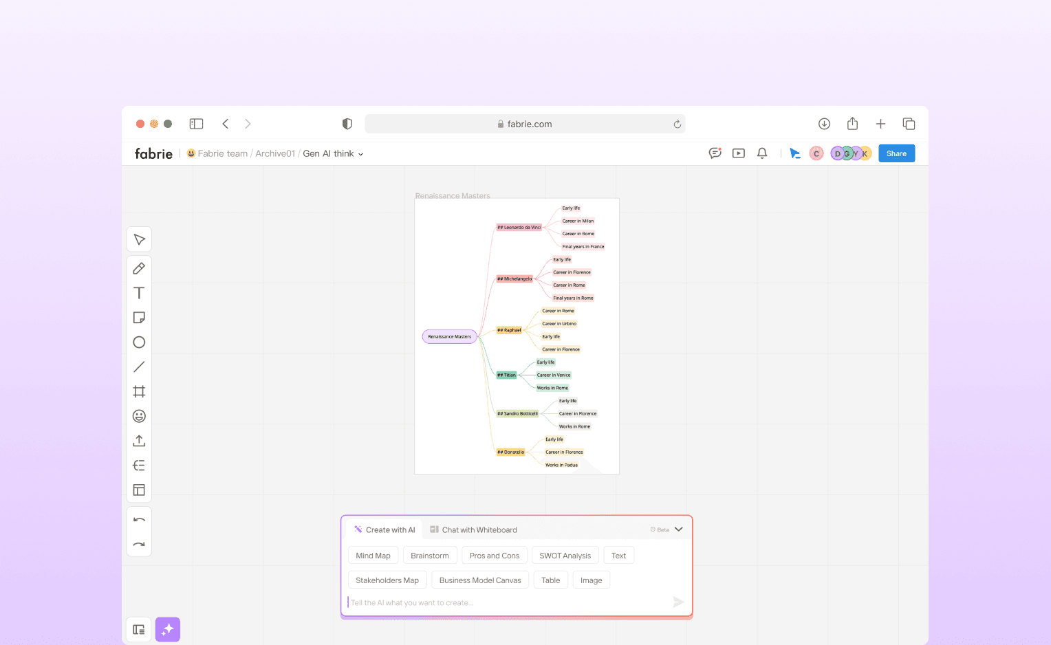
Streamline workflow with AI on the online whiteboard platform
Fabrie Whiteboard
LAUNCHED WORK
DESKTOP
2023
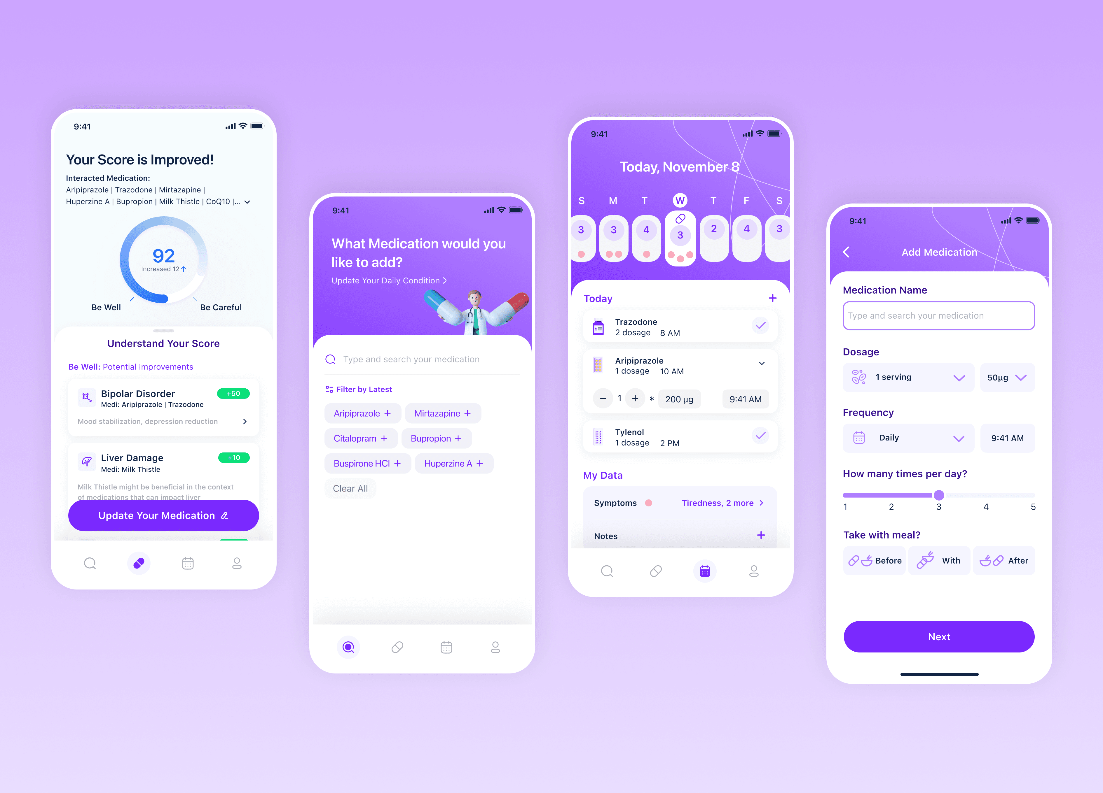
Empower healthcare with the medication management tool
3rd Place Winning Project at 2023 U-M Ross Hackathon
PASSION PROJECT
MOBILE
2023